
Hello crafty friends, I’ve been experimenting with Lisa Horton inks lately… and wow, they are so different from anything else in my stash.
I attempted to create a bold, shimmery, dreamy embossed background… But it didn’t turn out quite how I imagined because I added water.
That said, I rolled with the flow, and the results are still beautiful.
This was such a good experiment. It really helped me understand how these inks behave, especially on darker cardstock.
Lisa Horton Colour Shift and Interference Inks
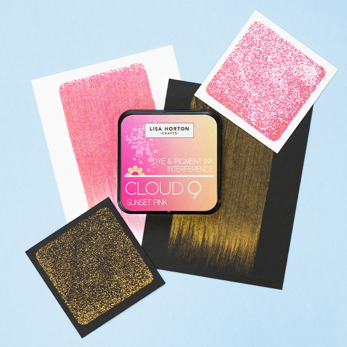
Two-in-one magic. High-shine mica creates dramatic color shifts that change based on cardstock color
- All the Lisa Horton inks are opaque, meaning that they offer full coverage.
- Fully blendable
- Dry fast
- Work on both white and black cardstock with colour-shifting properties.
- Have oxide-like properties. When sprayed with water, the inks get a milky tone.
- They reactivate when adding more ink or water over.
- They also provide different shimmer finishes.
- For maximum shine, do not apply water.
Video
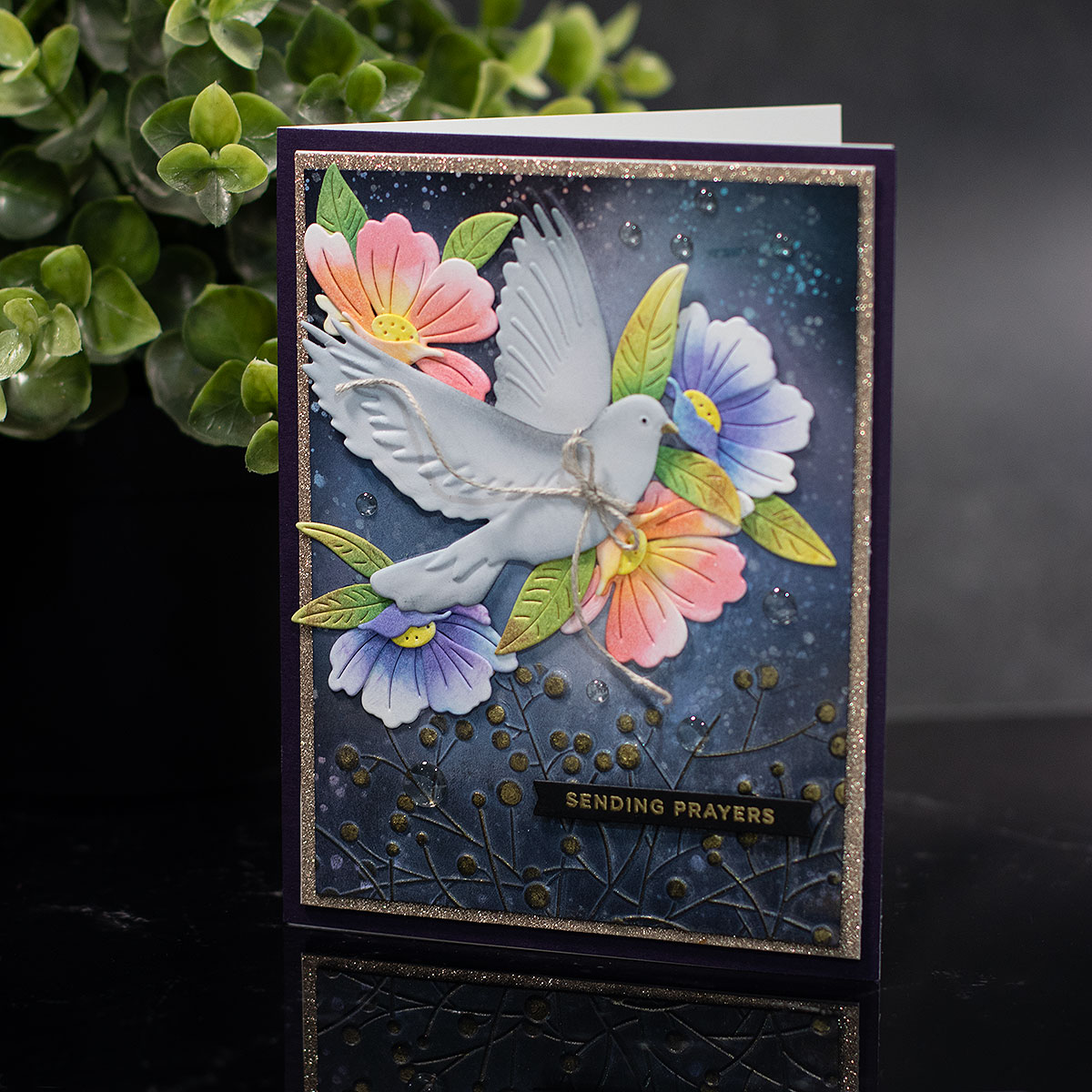
In the video, you will see me using the “Peaceful Dove 3D Embossing Folder” by Simon Says Stamp.
This embossing folder provides a background scene, and it allows you to create an embossed die-cut dove that you can layer over.
I wanted to create a white halo of ink with iridescent colours around it to highlight the dove.
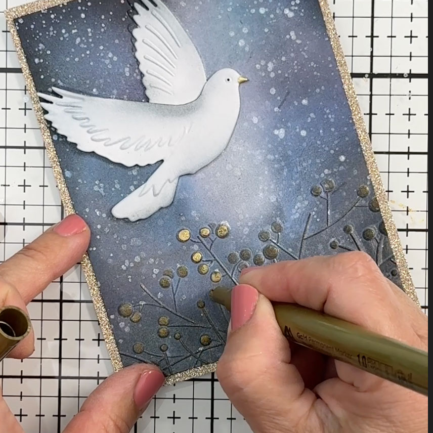
As you see in the video, I started by adding ink over a black piece of Very Black cardstock, then I embossed the paper.
I did not see the image well defined, so I decided to spray the paper with water and emboss it again.
Then, I noticed the inks blended and they lost their colour intensity and shine.
So once embossed, I repeated the inking process…
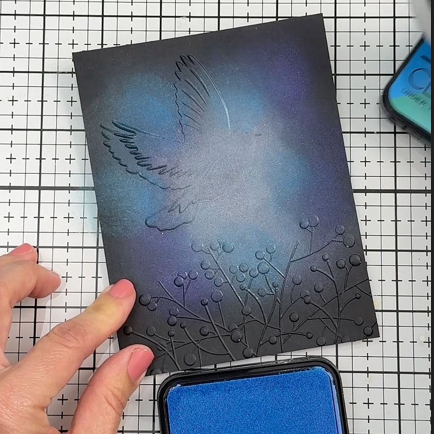
I loaded the brush with ink and then tapped it over the cardstock rather than applying it in a circular motion, because it caused the layers of ink to blend, and I wanted the colours to remain separate.
I really liked how the inks were looking here, but I also wanted to add gold metallic ink over the embossed branches and white watercolour paint spatters.
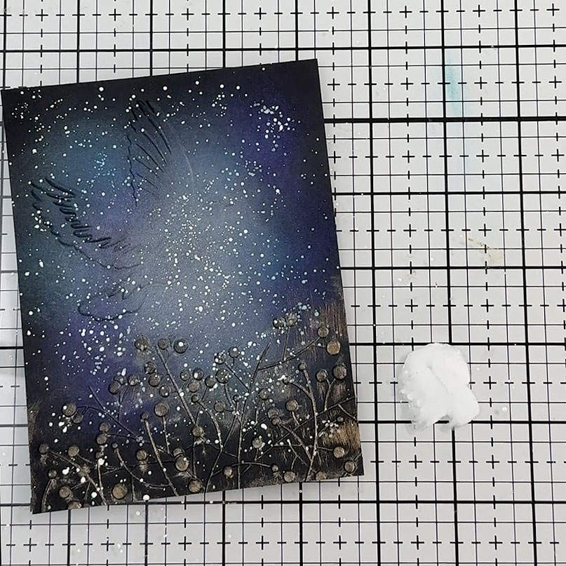
I sprayed the paper with water again and ran it through the embossing folder once more using the die-cutting machine.
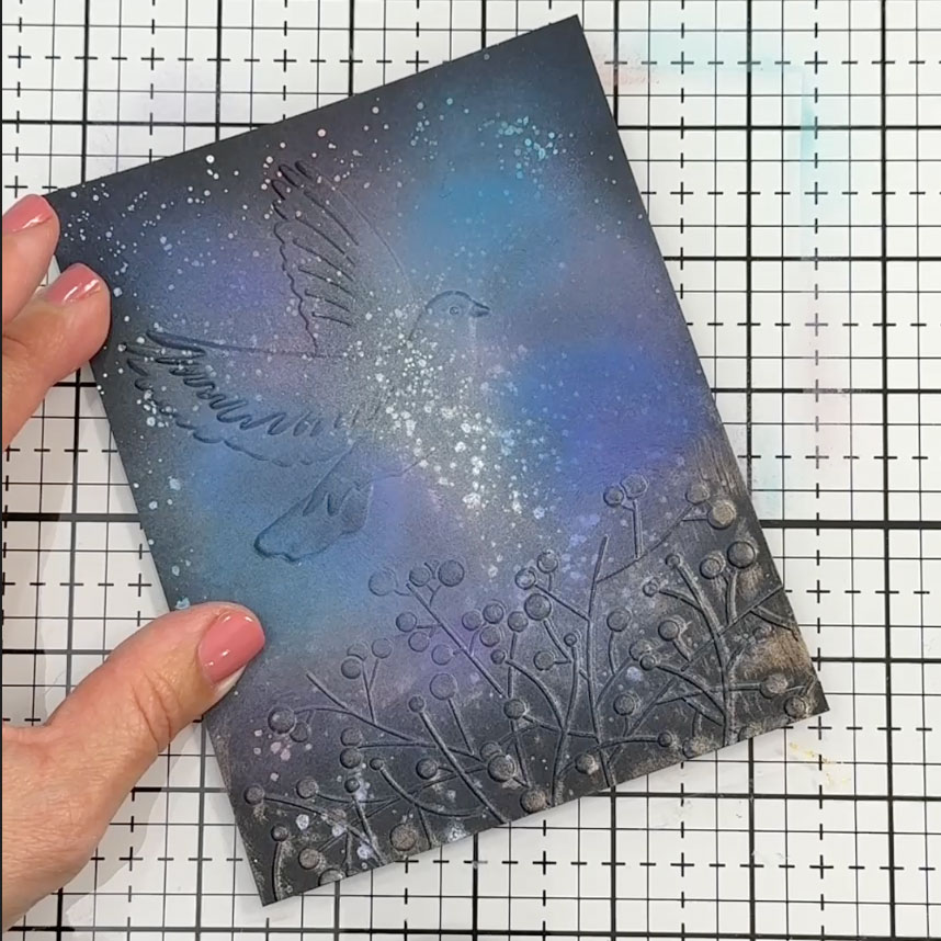
Then I applied Andy magenta and Helen Teal mat inks, Under the Sea, Lilac Meadow, Watermelon Spritz colour shift inks.
You can see how they partially cover the paint splatters in certain areas, totally blended.
Then I splattered silver Sparkle Base.
I also added white Altenew ink as well, at the centre of the panel and gold ink over the embossed branches, but the effect was too subtle, so I decided to pass a gold permanent marker over the raised areas of the embossed image…
I also added a hint of ink to the edges of the die-cut/embossed dove, and to add a little bit of dimension, I trimmed one of its wings as shown in the video and stuck it in place.
The panel was looking bare, so I decided to add flowers, and I made these using Iceland Poppies wafer dies.
I also die-cut a Privet Branch and trimmed the leaves to add a green element to the card
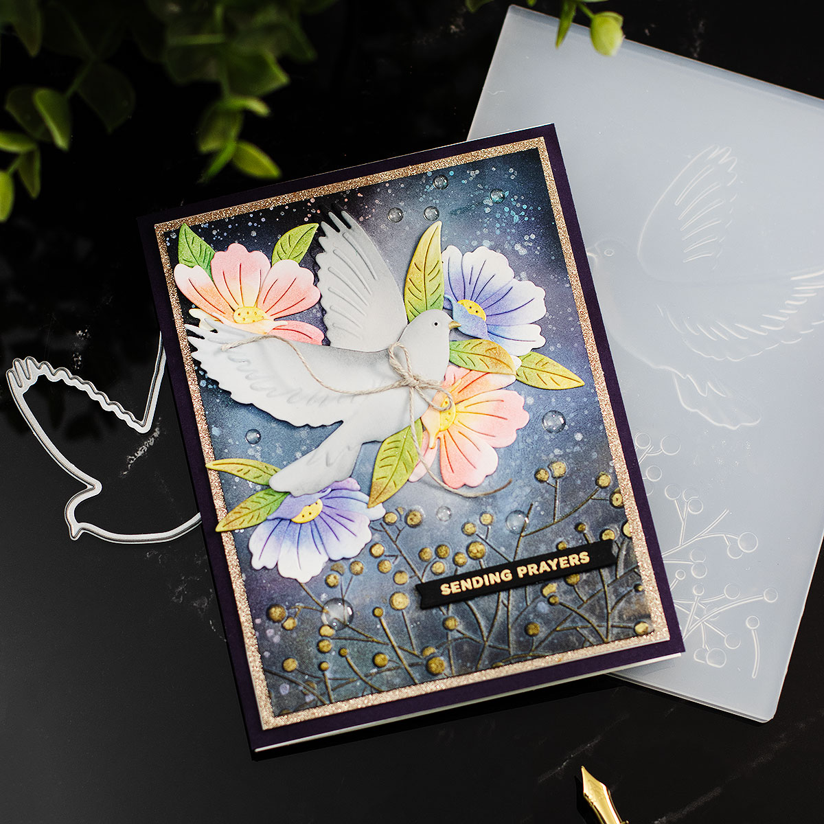
All the die-cuts were coloured using the same inks, so you can see how different they look on white cardstock.
I wish you could see the look and feel of the inks… they provide a very luxurious pearlescent accent.
That’s all for today.
Thanks for stopping by.
X Bibi
Thirsty for More?
Supplies
Affiliate links apply at no extra cost to you. Thanks for your support.


Leave a Reply